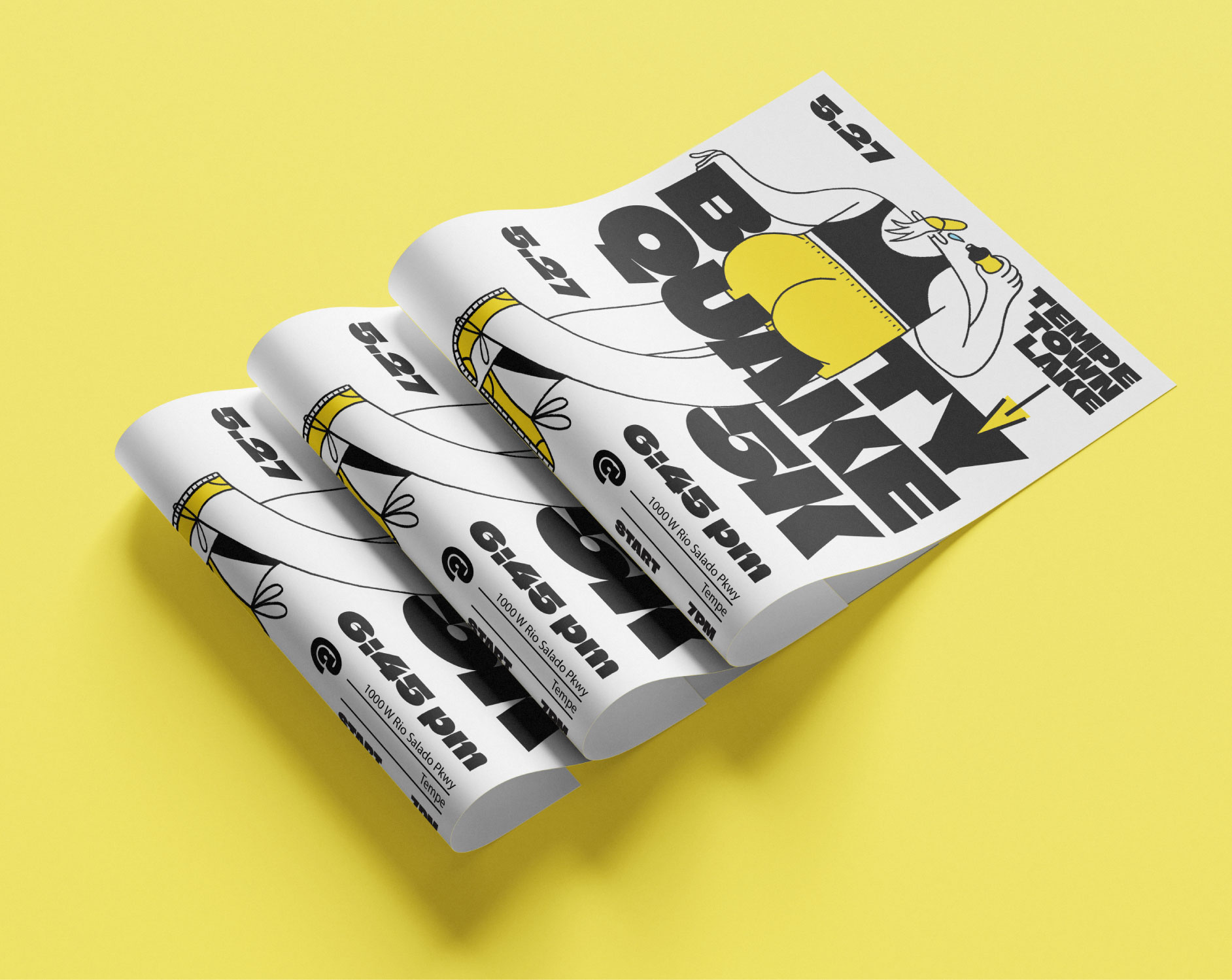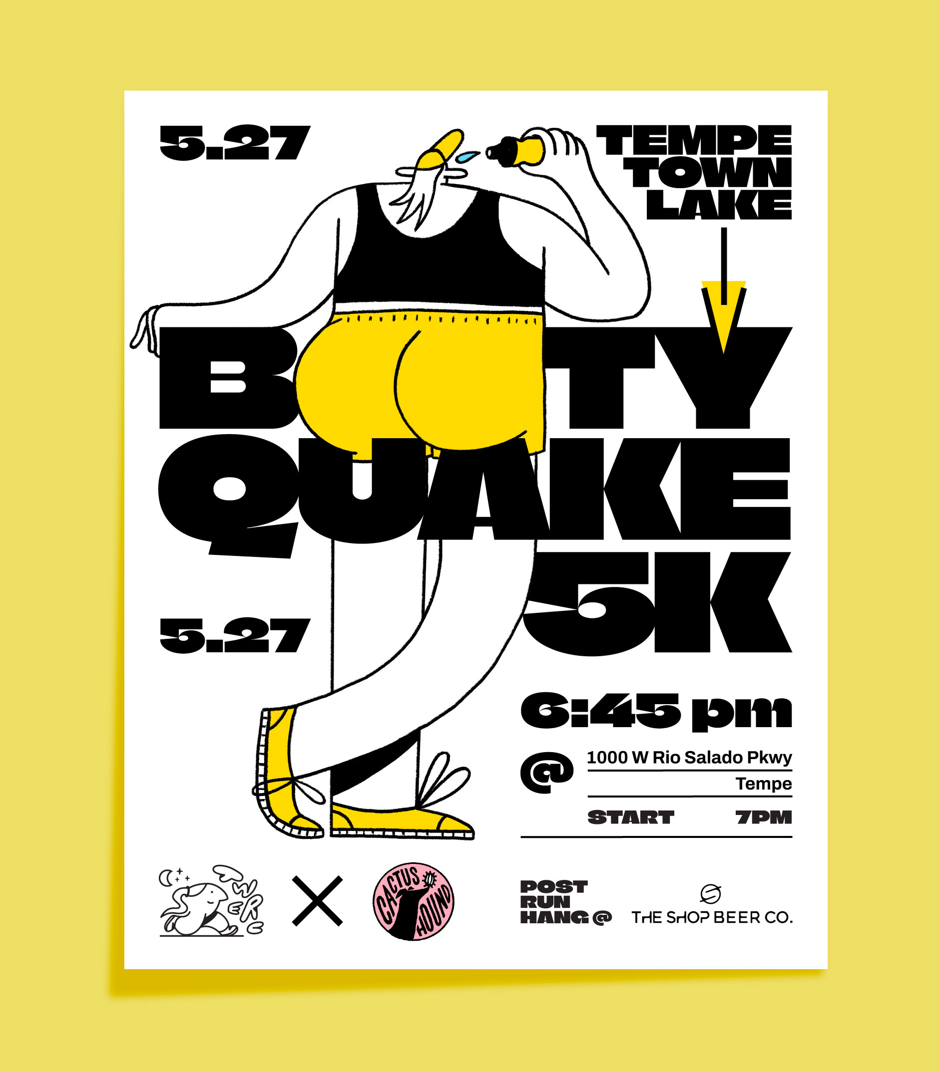
A pop-up 5k marathon needed a poster that matched the event's tongue-in-cheek(s) name. A bold and round typeface was used and paired with an equally bold and round illustration where the eponymous booty has its dual letter O's replaced humorously.
CLIENT: CACTUS HOUND X TWERC
ILLUSTRATION, TYPOGRAPHY