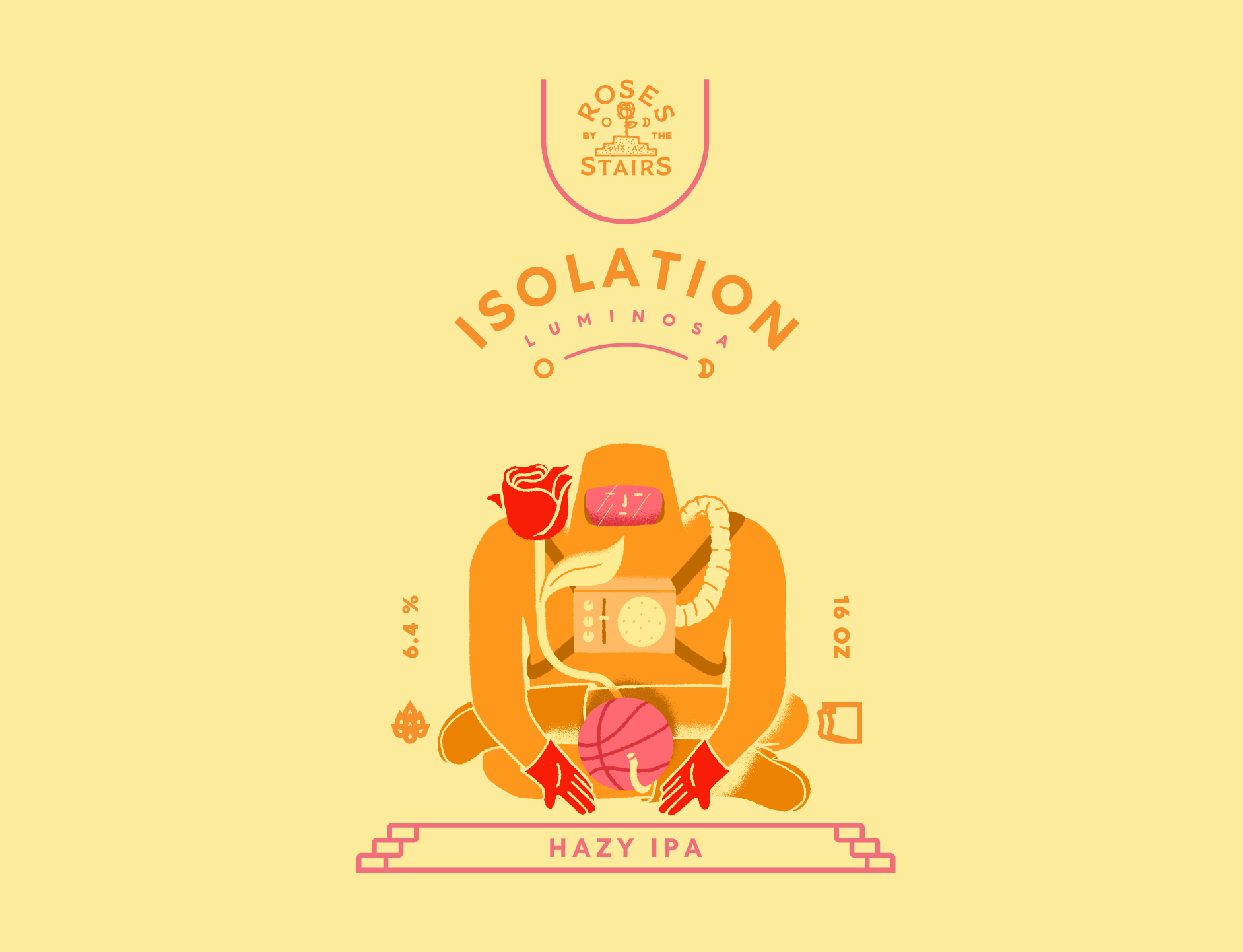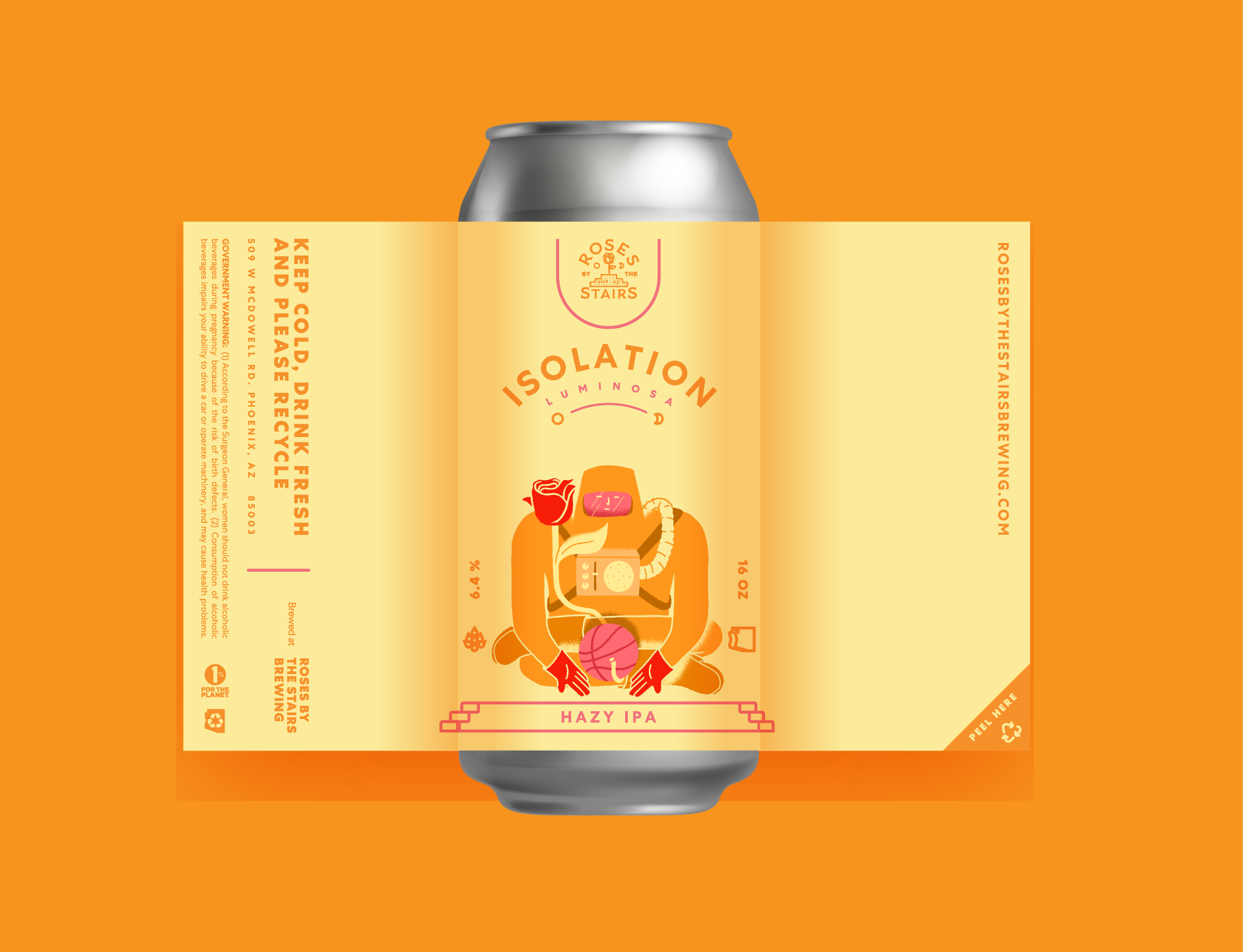
One of many collabs with a local Phoenix micro-brewery. A series of IPA brews were being developed, and they needed a consistent look across cans to designate what beer was being brewed with these "Isolation" hops.
The name “Isolation” was inspired by the offensive play in basketball where the court is cleared of all but two players facing off. The central illustration plays off both basketball and the image of an astronaut, isolated from the outside world by his space suit. The series, four hop variations in total, is represented by differing design colorways.
CLIENT: ROSES BY THE STAIRS BREWING
BRANDING, ILLUSTRATION, PACKAGE DESIGN