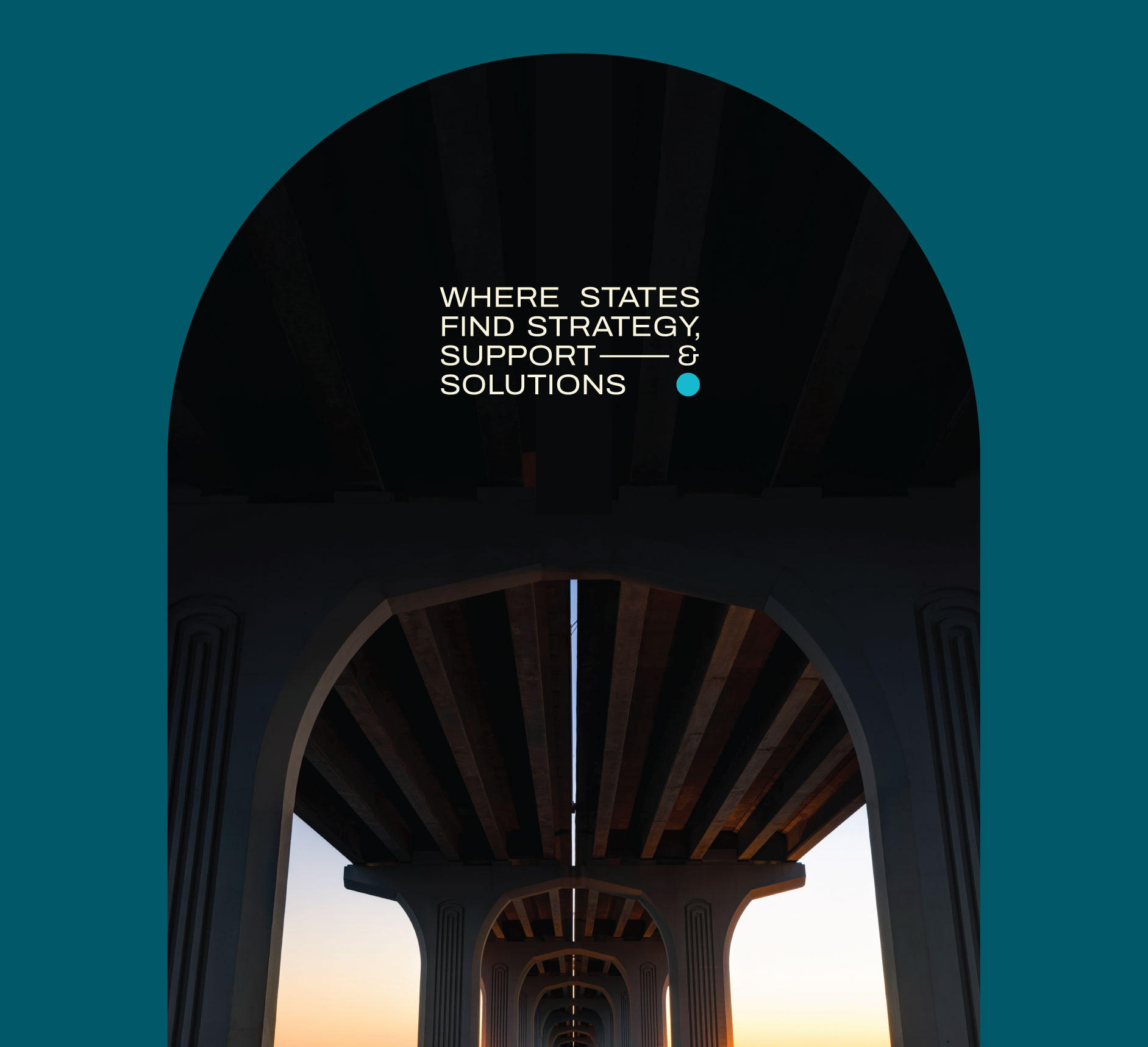
In preparation for NASCLA's 2026 annual conference, a brand was commissioned to represent this year's theme: Finding Strength Through Numbers. Work began, and the imagery of support systems led to a unifying statement: Where States Find Strategy, Support, and Solutions.
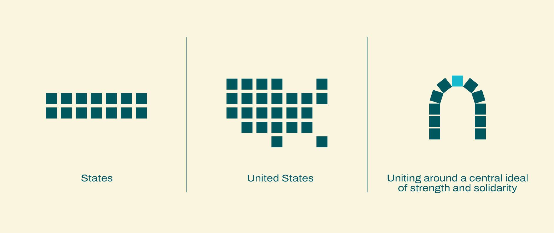
Using that as a thematic starting point, the arch was used as the foundation and brand reasoning.
CLIENT: NATIONAL ASSOCIATION OF STATE LICENSING AGENCIES
BRANDING, LOGO DESIGN, TYPOGRAPHY, PRINT DESIGN
THE CHAIN IS ROTATED TO LAND ON THE FINAL DESIGN. A CHAIN REPRESENTING THE STRENGTH OF ITS INDIVIDUAL LINKS AND A CENTRAL EYE TO REPRESENT FORWARD-LOOKING VISION.
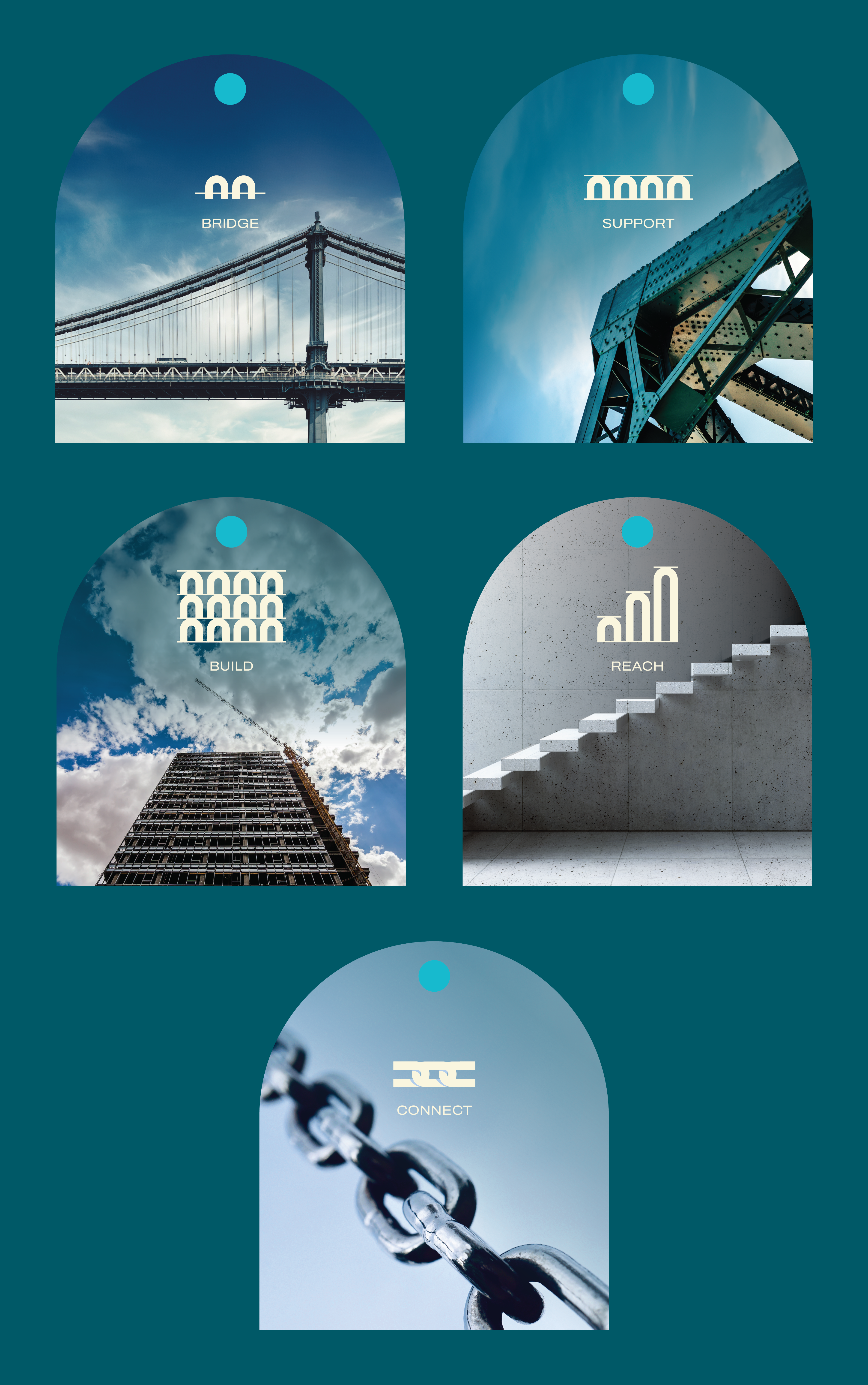
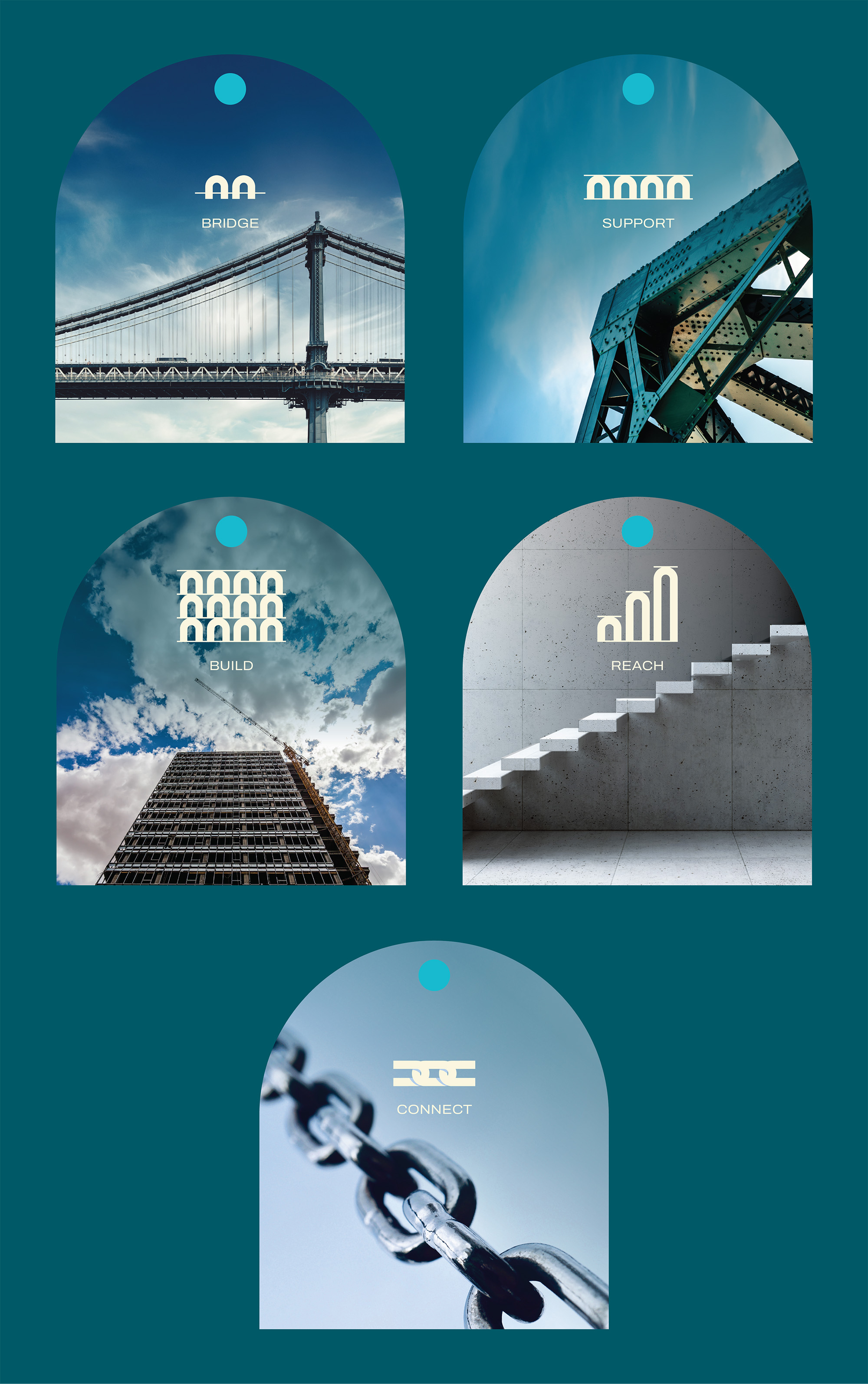
USING THE ORIGINAL ARCH GRAPHIC, A SERIES OF ICONS WERE DEVLOPED TO REPRESENT THE VARIOUS TIERS OF THE STRONGER TOGETHER BRAND MESSAGE. THESE WERE GIVEN THEIR OWN SUB-BRAND COLOR AND A MINIMAL ICON TO PAIR WITH IT.
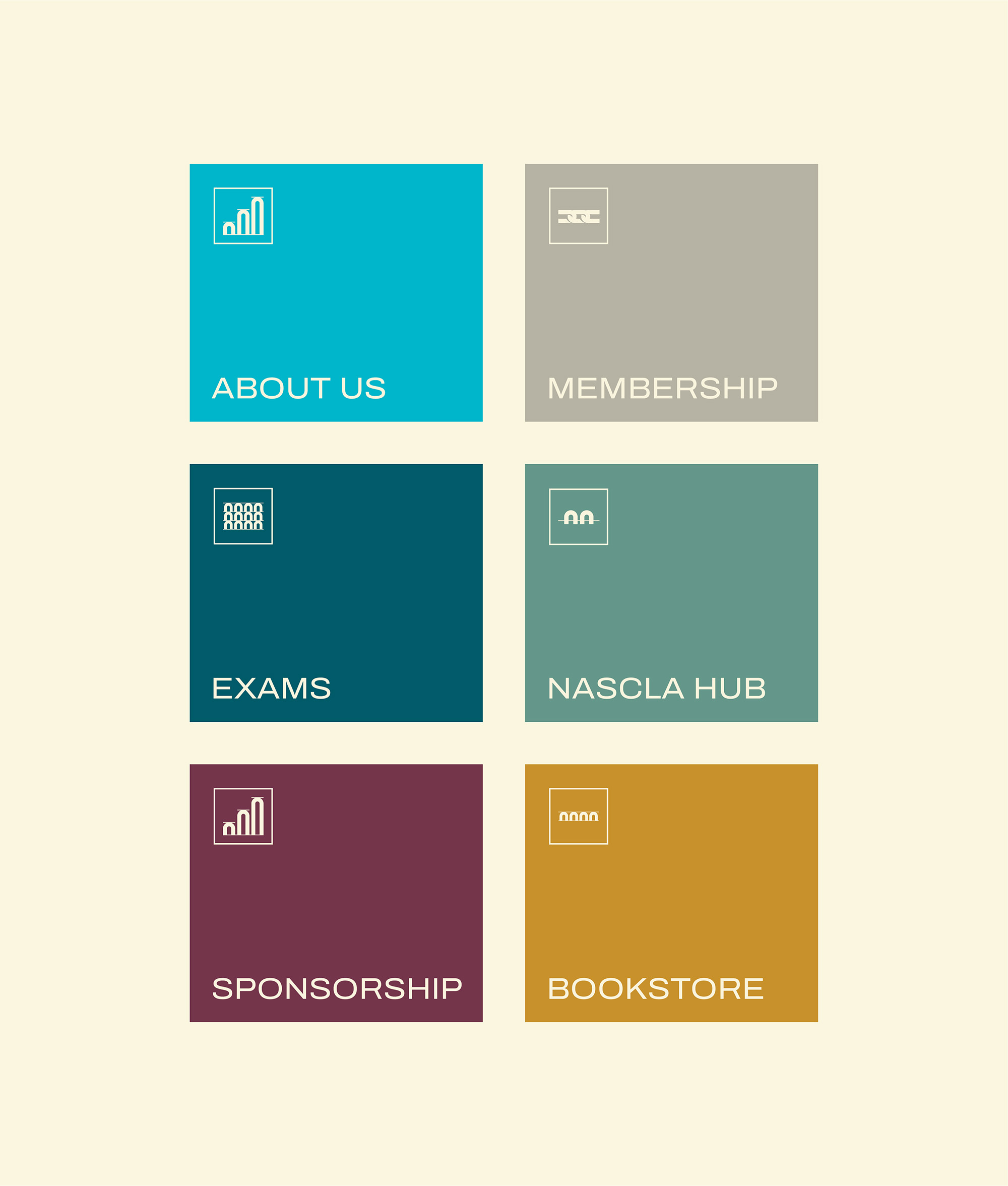
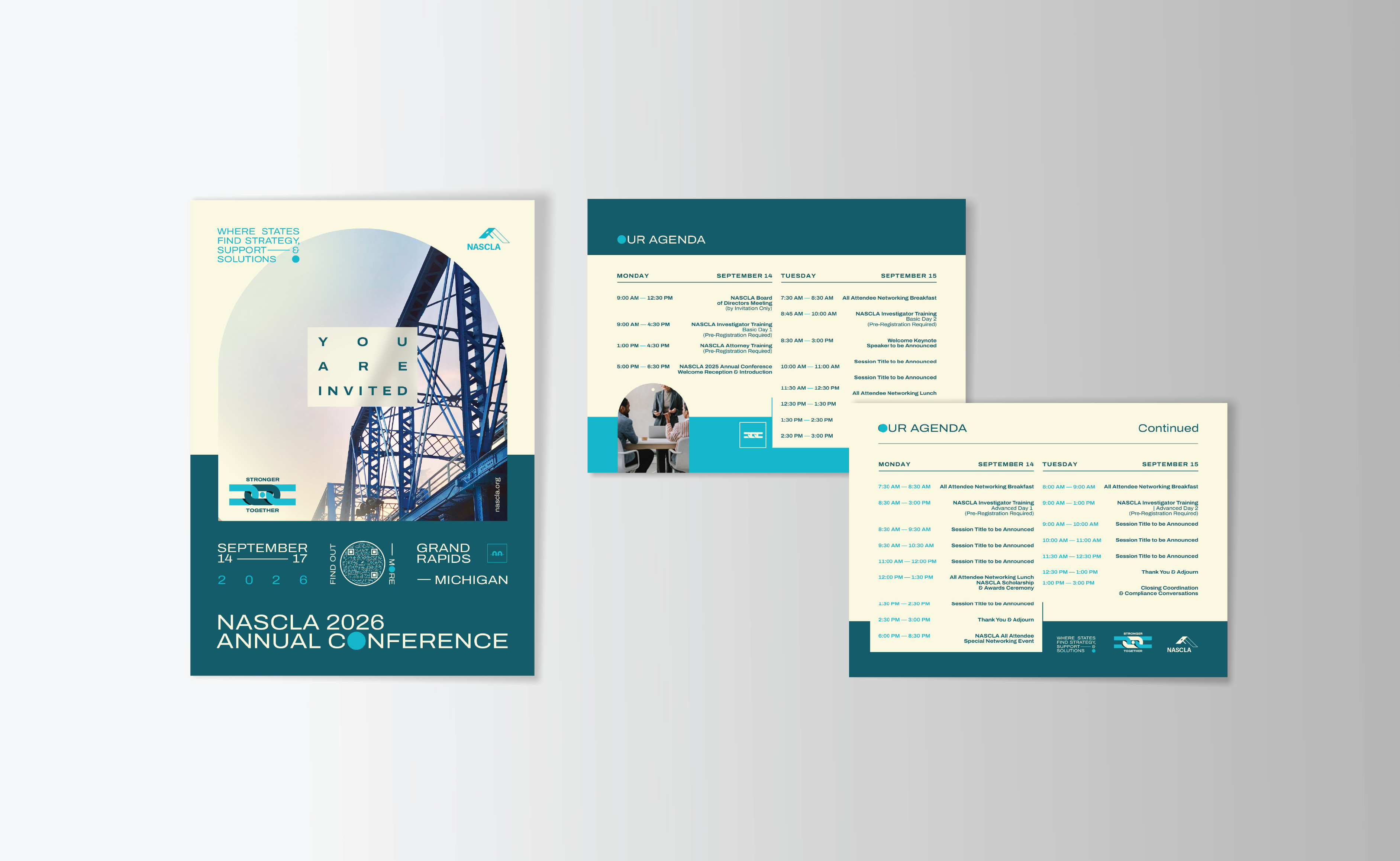
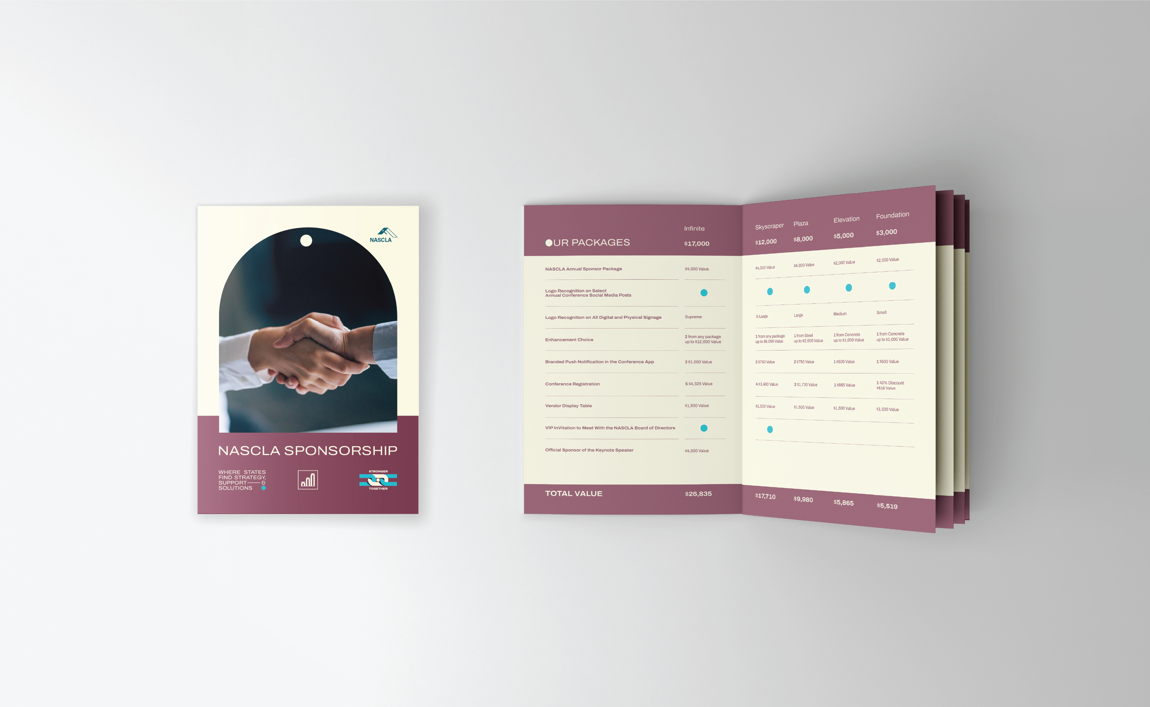
THE STRONGER TOGETHER BRAND WAS THEN USED ACROSS ALL CONFERENCE COLLATERAL INCLUDING EVENT INVITATIONS, CONFERENCE AGENDAS, AND PRE-CONFERENCE SPONSORSHIP BROCHURES.