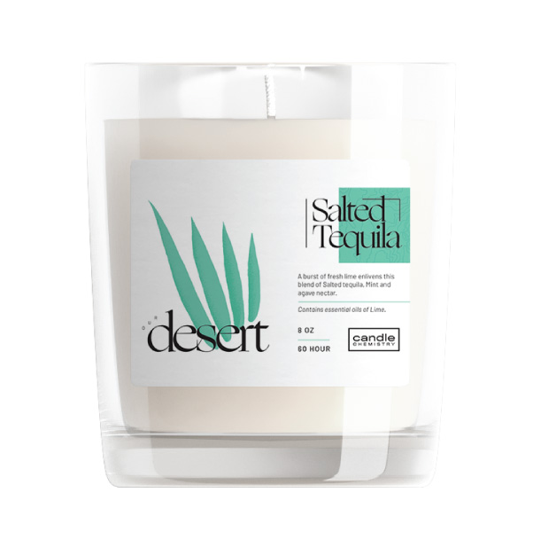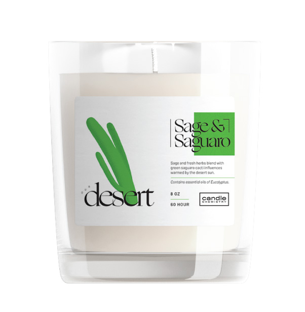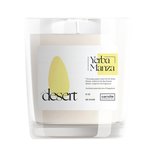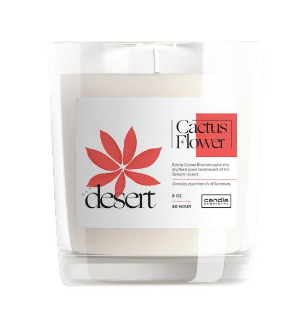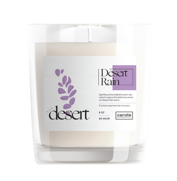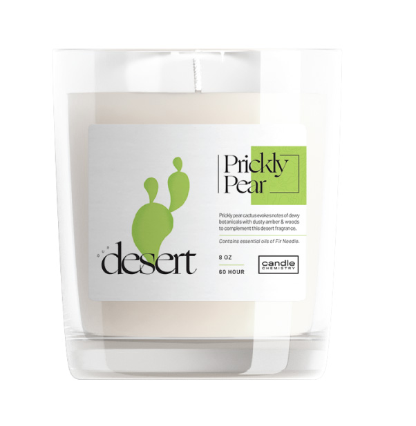
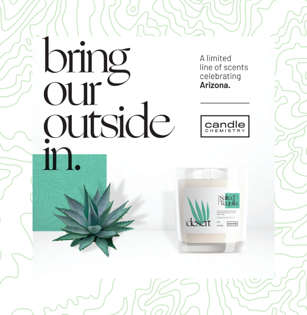
Candle Chemistry is both a candle storefront and a space offers candle-making workshops. Being local to the Phoenix area, they wanted to develop a series of candles that celebrate the scents of the Arizona desert.
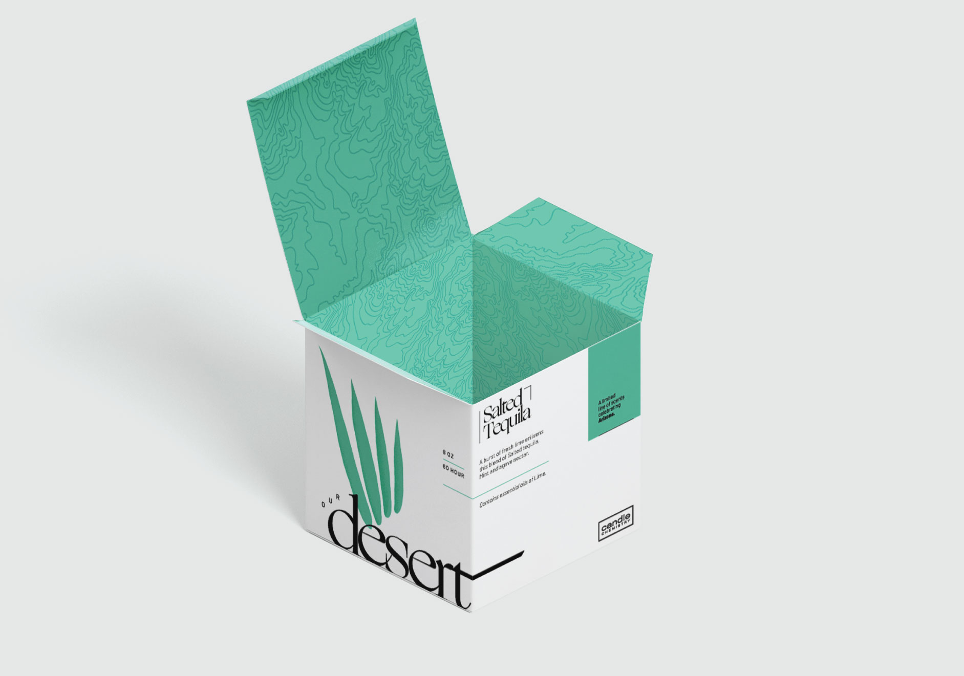
A series of illustrations were developed as a means to categorize each candle's packaging by shape and color, along with topographic maps of the Sonoran Desert used as design highlights on the outside and inside.
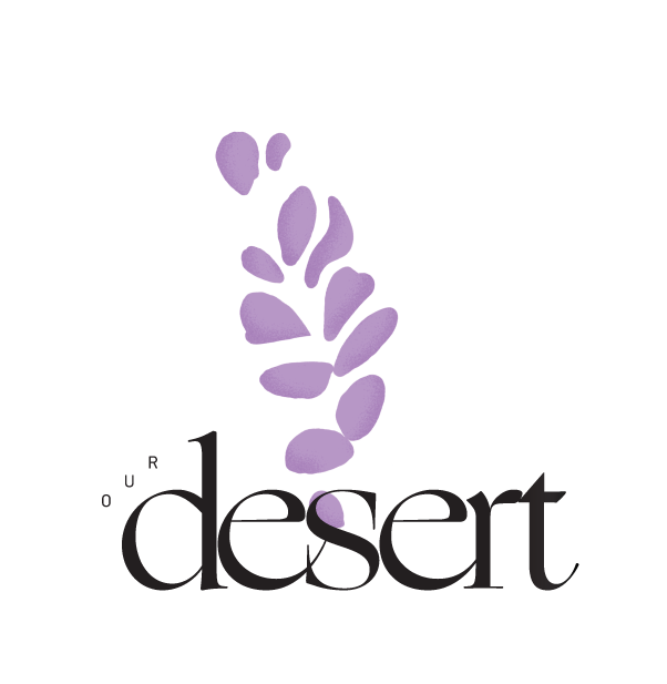
CLIENT: CANDLE CHEMISTRY
BRANDING, LOGO DESIGN, ILLUSTRATION, PACKAGE DESIGN


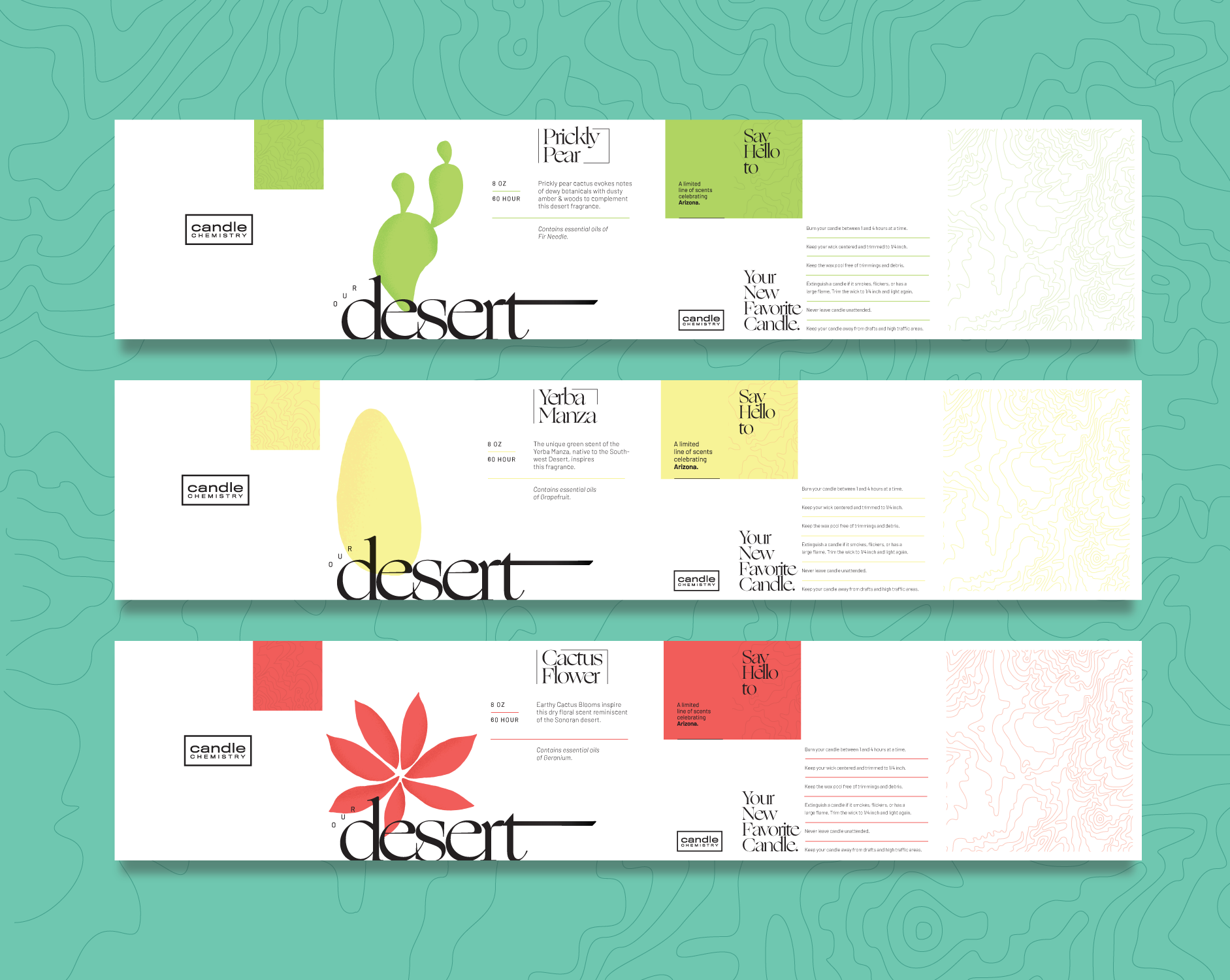
EACH BOX WAS DESIGNED TO MAINTAIN THAT A MAJOR ELEMENT OR PIECE OF INFORMATION WAS PRESENT ON EACH SIDE. THAT WAY, NO MATTER HOW THEY PRESENTED THEMSELVES ON A SHELF, THE END USER WAS SEEING AN ESSENTIAL PIECE OF INFORMATION.